For this task we were asked to use the three of the five tutorials from the website in this link: Create 5 High-Impact Typography Effects in Adobe InDesign. The tutorials had to be recreated by us designers, changing the wording, colours, to something we deemed more relevant and/or creative.
Tutorial One: Text-Inside-Text Effect
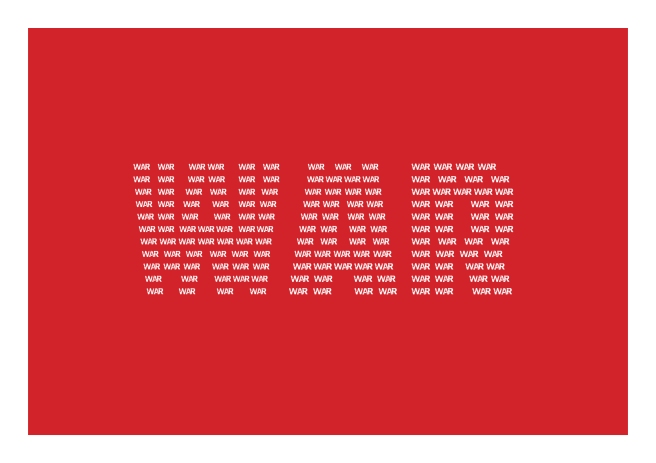
For this first tutorial, we were shown how to put text-inside-text, to create this cool typographic effect. In the tutorial the word used was “Inside” and the inside text was placeholder text. So when I recreated the tutorial I chose to change the main word to “War” and the inside text to be “War” repeated continuously. I also chose to change the contrasting background to red to continue on with the idea of war. I chose to do this to the tutorial design because I think the effect really enhances the word ‘war’ and the red background also enhances this effect more, rather than a blue background which wouldn’t give you the same feeling when looking at the typographic design.
I think the tutorial was useful and overall I’m pretty happy with the design because it was my first attempt at doing this effect. I think the kerning between the words is really sporadic throughout the design, and with trial and error I was able to reduce this slightly but not completely; I’m also unsure why it has done this. If was going to do this effect again I would maybe choose a word with less shape in the lettering, because the gaps in the ‘A’ and ‘R’ meant that the wording inside didn’t space evenly.
Tutorial Two: Block-Colour Text Effect
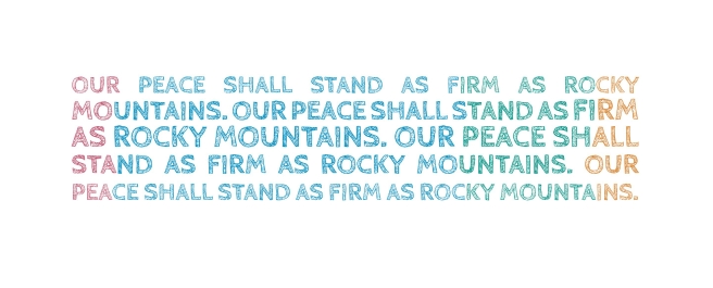
This second tutorial was a lot simpler than the first tutorial, and I found it fun to try out. I didn’t change much of the design from the tutorial, I kept the same colour swatches from the tutorial just swapped the swatch placings around a bit. I also changed the text from the tutorial text to “Our peace shall stand as firm as Rocky mountains.” I chose to do this because it is a famous Shakespeare quote, and I thought it would work well in this design. I chose not to change the swatch colours because liked the ones the tutorial had and after trying my own swatch creations I found I like the original ones better.
I think this tutorial design turned out good, I think if the background was a different colour the design might get an even better effect, but for my first attempt at this effect style, I am pretty happy with my efforts. I think if I did this tutorial again I could try and change the colour swatches and also maybe try and changed the sizing on the individual letters in the text to give a different effect.
Tutorial Three: Vintage Style Effect Using Type on a Path Tool

This tutorial was the best in my opinion I found the final typographic design to be really creative and quirky and there is a lot more room to add your own original twist to the tutorials original design. I first changed the wording from the tutorial to a quote from the Handmaid’s Tale by Margaret Atwood, I thought the quote was quirky and would in nicely with this design. I also had a lot of fun changing the paths and adding little effects to the lettering in the design. I think added little additions of colour to some of the letters because I liked how the tutorial had done this also, I just used the same swatches from the first tutorial.
This is probably my favourite final design out of the three, I definitely think this is the type of effect I would use for my own typographic designs. I think in terms of improvements I could spend a little more time on the spacing between the text paths and try and add even more effects to them.
Websites I used:
https://www.lifewire.com/set-up-guides-in-adobe-indesign-1074369
https://www.shortlist.com/entertainment/books/the-40-most-powerful-literary-quotes/96712
